Hearts Treasure Foundation
Hearts Treasure Foundation came to me seeking a visual identity that could carry their message of care and community across every touchpoint—from web and social media to print materials and event signage.
WHAT ROOD COMPANY DELIVERED
Logo Design
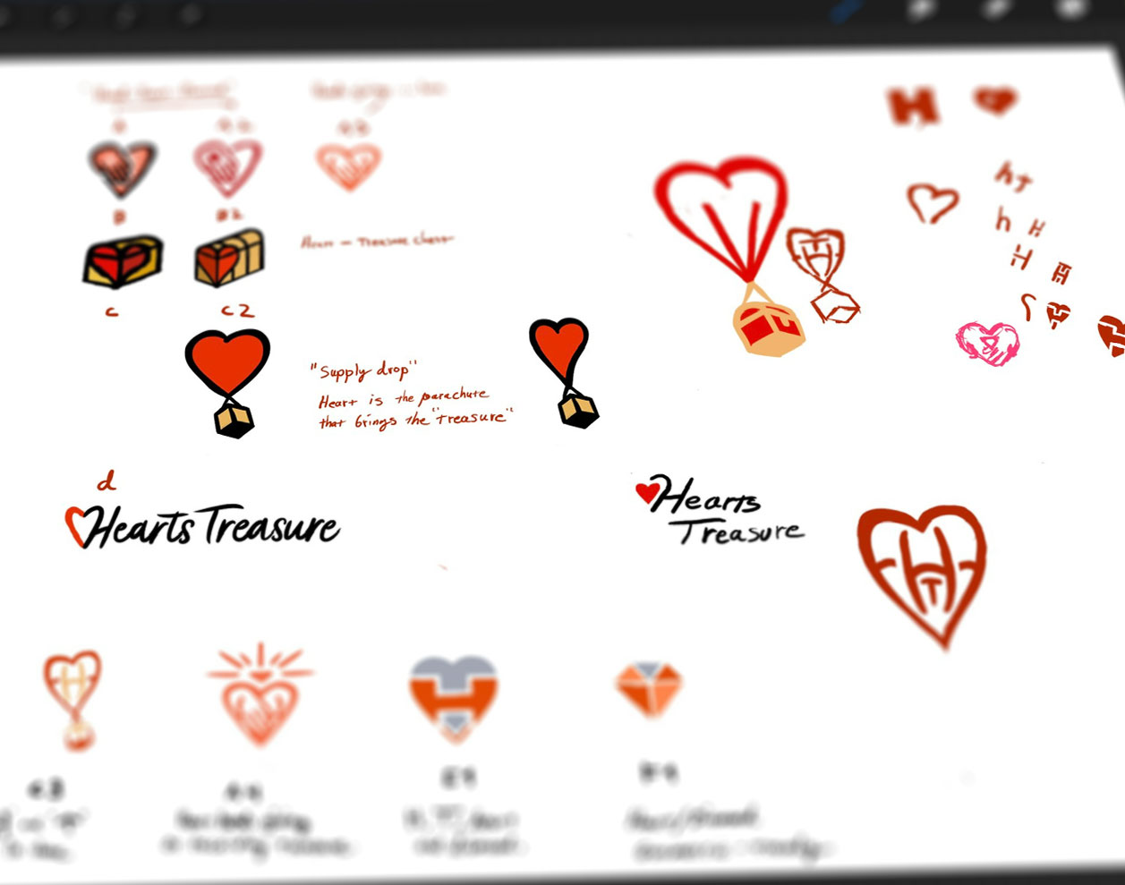
We started with detailed “heart in hands” sketches and even experimented with a heart-shaped parachute delivering a treasure box—each draft honing in on the idea of giving and hope.
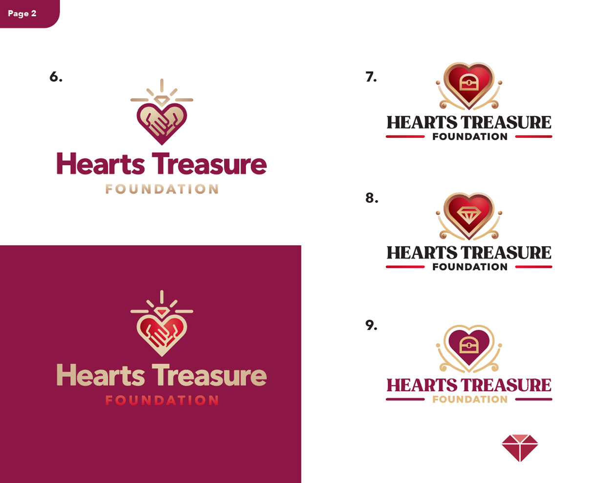
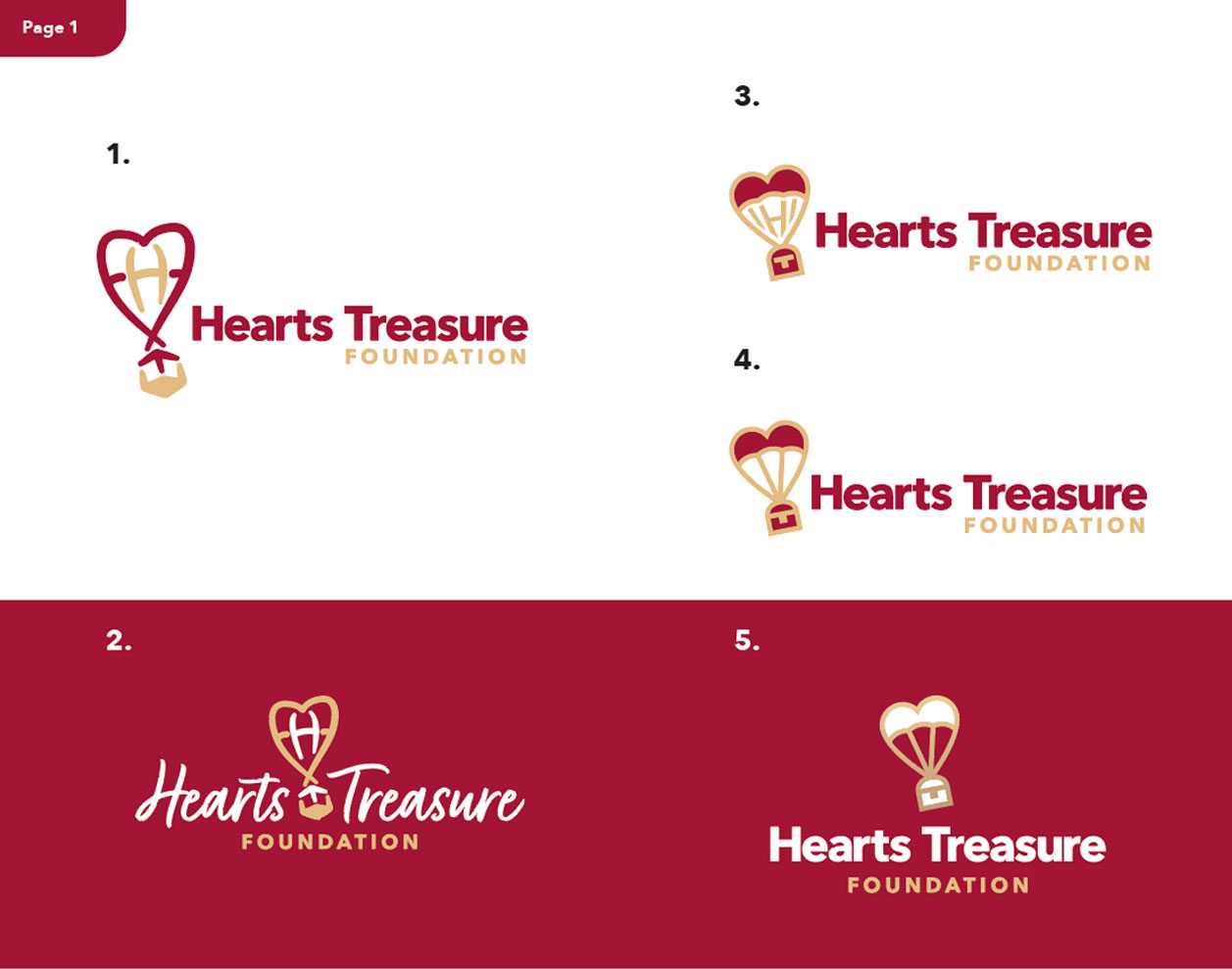
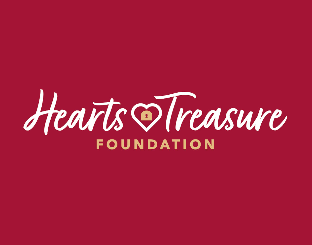
The Final Mark
The winning logo is a clean, bold heart icon with a treasure chest—instantly legible, versatile, and brimming with meaning at any scale.
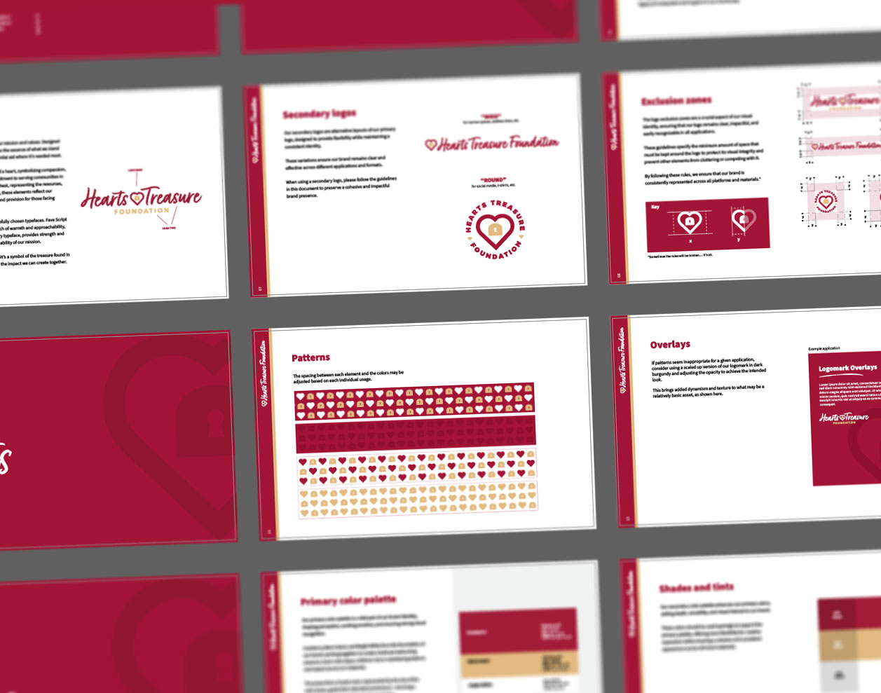
Defining the Identity
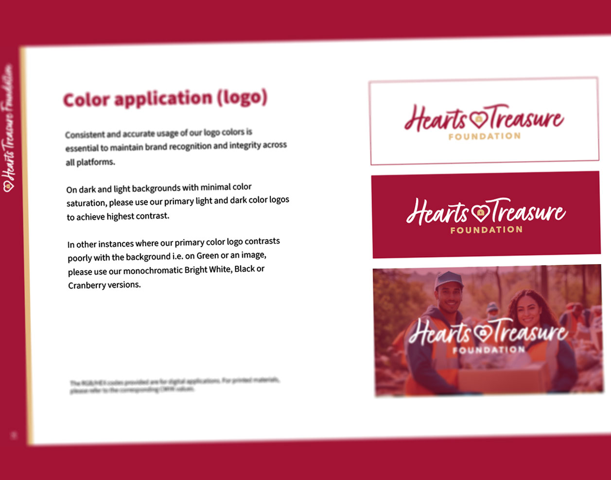
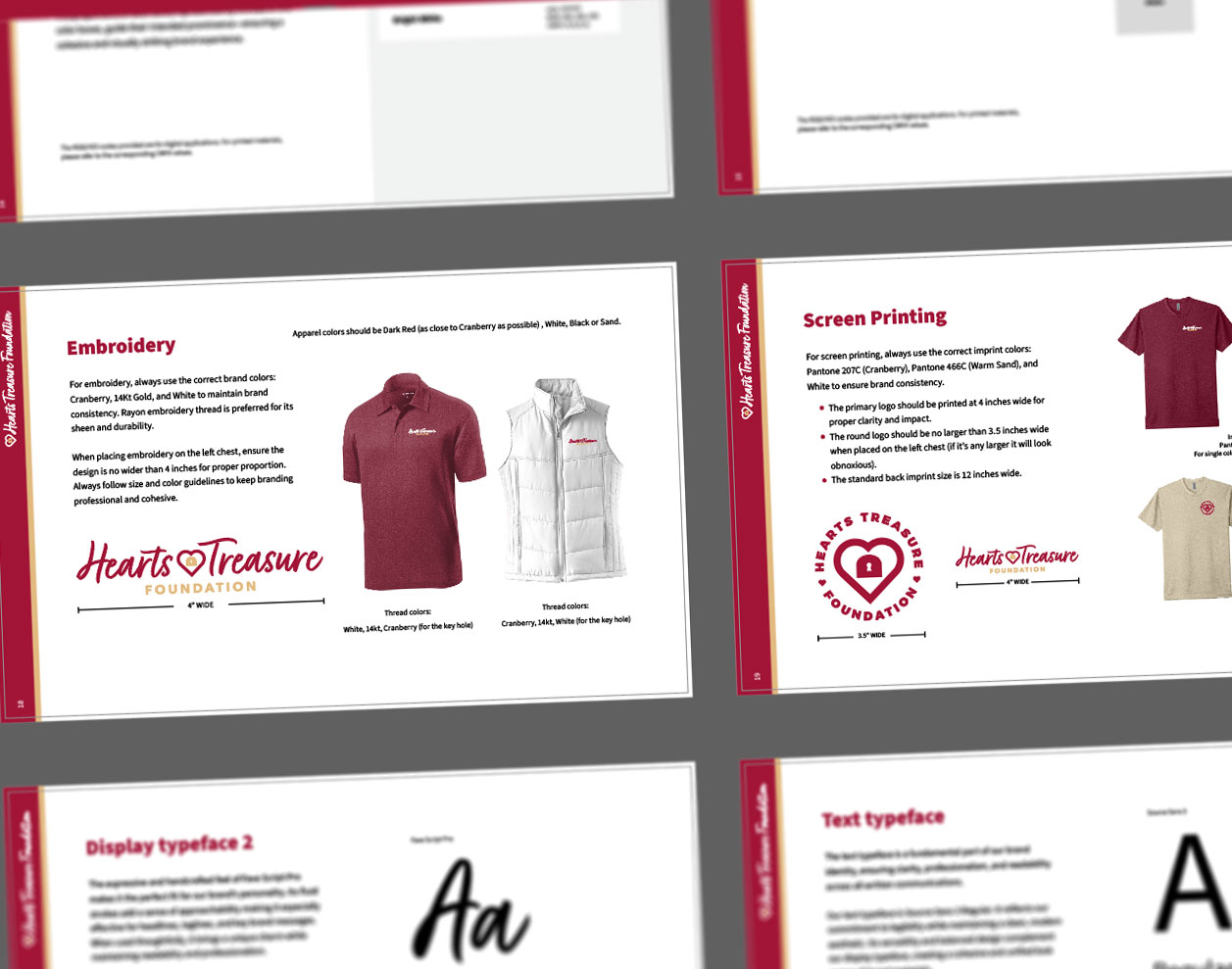
Our brand guide specifies a Cranberry, Warm Sand, and Bright White palette alongside Script Pro’s elegant curves and Source Sans 3’s modern readability—guaranteeing consistency across every application.
This streamlined, emotionally resonant identity now serves as the foundation for all their communications, helping them build trust and recognition as they deliver vital aid to communities in need.